Custom branding
This feature enables you to customize the look and feel of the Shake SDK. You can reflect your brand's identity by modifying colors, fonts, and other attributes of screen elements.
You're viewing the iOS docs. Other platforms → Android React Native Flutter Web
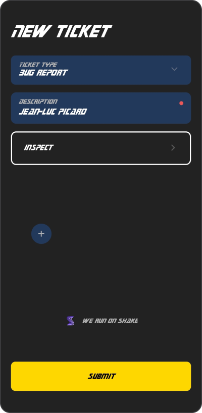
Star Trek style
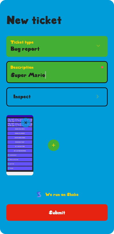
Super Mario vibes
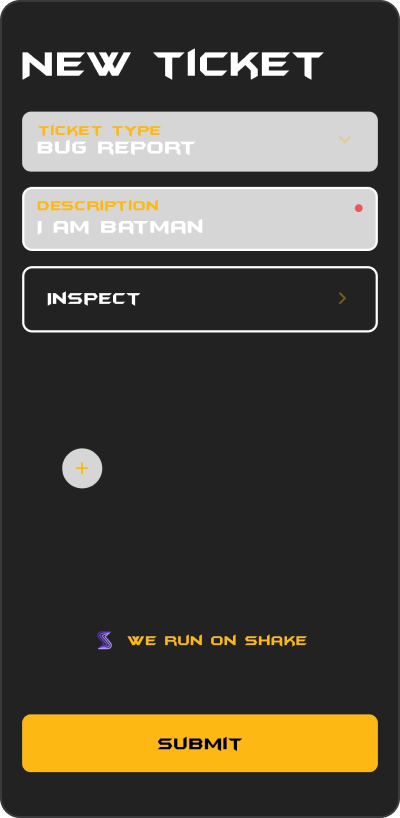
Batman UI
Setting up a custom theme
Use SHKTheme instance to customize appearance of the Shake screens. Here is an example how you can create and set a new Shake theme:
- Objective-C
- Swift
SHKShake.configuration.theme = [[SHKTheme alloc] initWithFontFamilyMedium:@"Charter-Roman"fontFamilyBold:@"Charter-Bold"background:UIColor.grayColorsecondaryBackground:UIColor.lightGrayColortextColor:UIColor.blackColorsecondaryTextColor:UIColor.blackColorbrandAccentColor:UIColor.orangeColorbrandTextColor:UIColor.whiteColorborderRadius:39outlineColor:UIColor.blackColorshadowInfo:[[SHKShadowInfo alloc]initWithOffset:CGSizeMake(4, 2)opacity:1radius:2color:UIColor.blackColor]];
Shake.configuration.theme = SHKTheme(fontFamilyMedium: "Charter-Roman",fontFamilyBold: "Charter-Bold",background: .gray,secondaryBackground: .lightGray,textColor: .black,secondaryTextColor: .black,brandAccentColor: .orange,brandTextColor: .white,borderRadius: 39,outlineColor: .black,shadowInfo: .init(offset: .init(width: 4, height: 2), opacity: 1, radius: 2, color: .black))
Dark and light mode
If you want to create a different appearance for the dark and light mode, you should use dynamic colors like shown below:
- Objective-C
- Swift
UIColor *myDynamicBackground = [UIColor colorWithDynamicProvider:^UIColor * _Nonnull(UITraitCollection * _Nonnull traitCollection) {return traitCollection.userInterfaceStyle == UIUserInterfaceStyleDark ? UIColor.orangeColor : UIColor.whiteColor;}];
let myDynamicBackground = UIColor { trait inreturn trait.userInterfaceStyle == .dark ? UIColor.orange : UIColor.white}
Dynamic colors are available from iOS 13. If you want to support dark and light mode on older versions, you should implement theme configuration listener and set appropriate colors through Shake method.
Changing the default theme
Sometimes you'll want to change just a specific color from the default theme. Let's say you want to change the default accent color on the screens but wants to keep all other default colors.
You can do it like shown in the example below:
- Objective-C
- Swift
SHKShake.configuration.theme.brandAccentColor = UIColor.orangeColor;
Shake.configuration.theme.brandAccentColor = UIColor.orange